Here we cover the visual interface of the two most-used applications in ATLAS
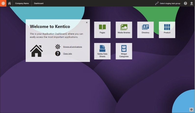
Main Dashboard Interface
Dashboard Navigation Bar
The bar at the top of the page appears through all the ATLAS applications. It has a shortcut to the main dashboard, the applications menu and more. It also acts as crumbtrail navigation which is customized to the application. Read below for details on what each part of the navigation bar represents.

Cogwheel Icon
Clicking on the cogwheel icon slides open the Applications selection menu and provides access to a Live Site button.
Home Icon
Clicking on the home icon in any application brings the user back to the home dashboard.
Select Staging Task Group
The system allows users to create groups for organizing staging tasks. Groups can represent individual work projects, changes that affect a specific section of a website, or any other collection of related staging tasks. For more about this, connect with the help team.
Kentico Help
Oriented to assist Kentico developers, the help information here is not relevant to general users. Utilizing the custom ATLAS Support Site is highly recommended instead.
User Menu
User login and sign out capabilities.
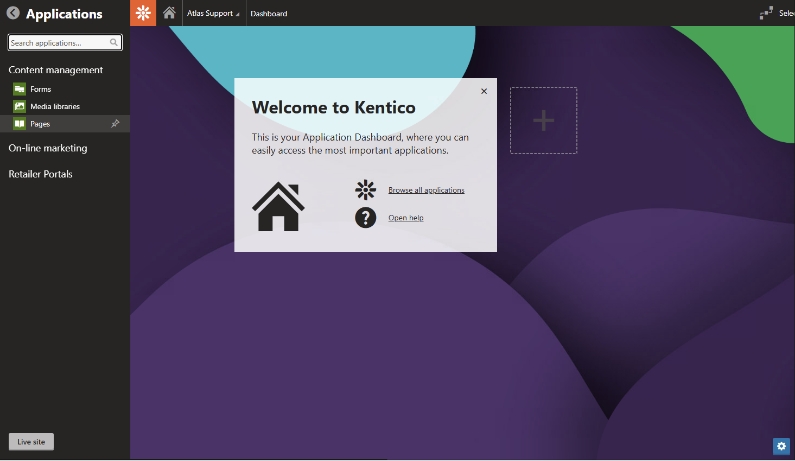
Applications Menu
Clicking the cogwheel icon opens the Applications menu. Search for an application or explore the content tree. Close the menu by clicking on the arrow icon.
Click the links below for further applications information on the ATLAS Support Site.
Close Applications Menu Icon
Click to close menu and return to standard dashboard.
Live Site Button
Click to open a live version of the site in a new window. Note the live site takes 30 minutes to update with newly saved content to allow time for last-minute changes.
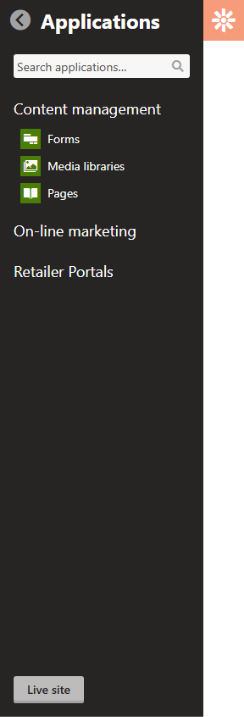
Content Management
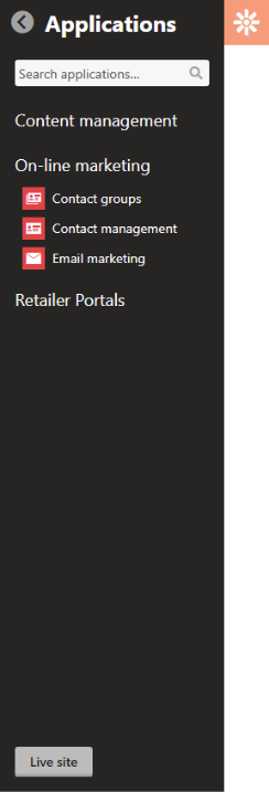
On-Line Marketing
Retailer Portals
- Canonical Tag
- Directory
- Facebook Pixels
- Historical Cash Bids
- Locations
- Marketing Pixels
- Navigation Setting
- Product
- Product Delivery
- Safety Data Sheets
- Schema Tag
- Timeline
- Widget Categories
Main Dashboard/Pinboard
Home Dashboard Pinboard for Favorite Applications
Pinned applications can be dragged to reorder them as desired. They now offer one-click access to favorite applications.
Click Edit Dashboard gear icon to activate application pinning.
Search or select an application to pin to the dashboard. A small pin icon will appear next to the application on selection and it will be added to the plus box on the dashboard.
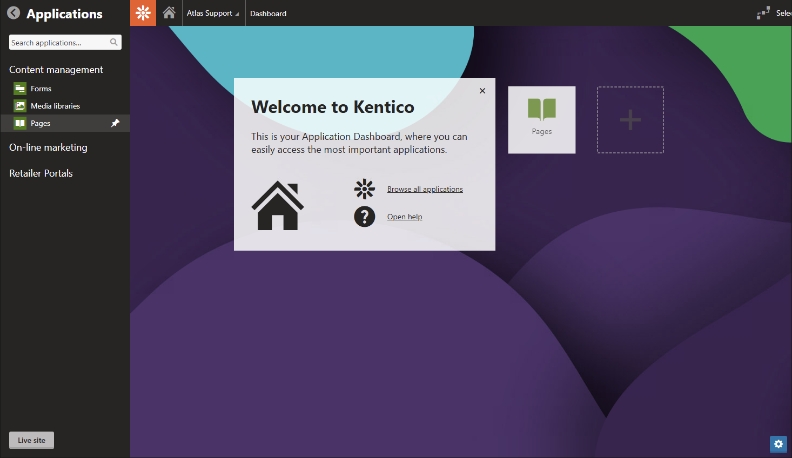
Click the plus box to add another application to the dashboard. Continue adding applications until done. Click Edit Dashboard gear icon again to deactivate application pinning.
ATLAS Pages Application Interface
The Pages Application displays the entire website in an index view to allow for moving, editing, adding, cloning and deleting web pages.
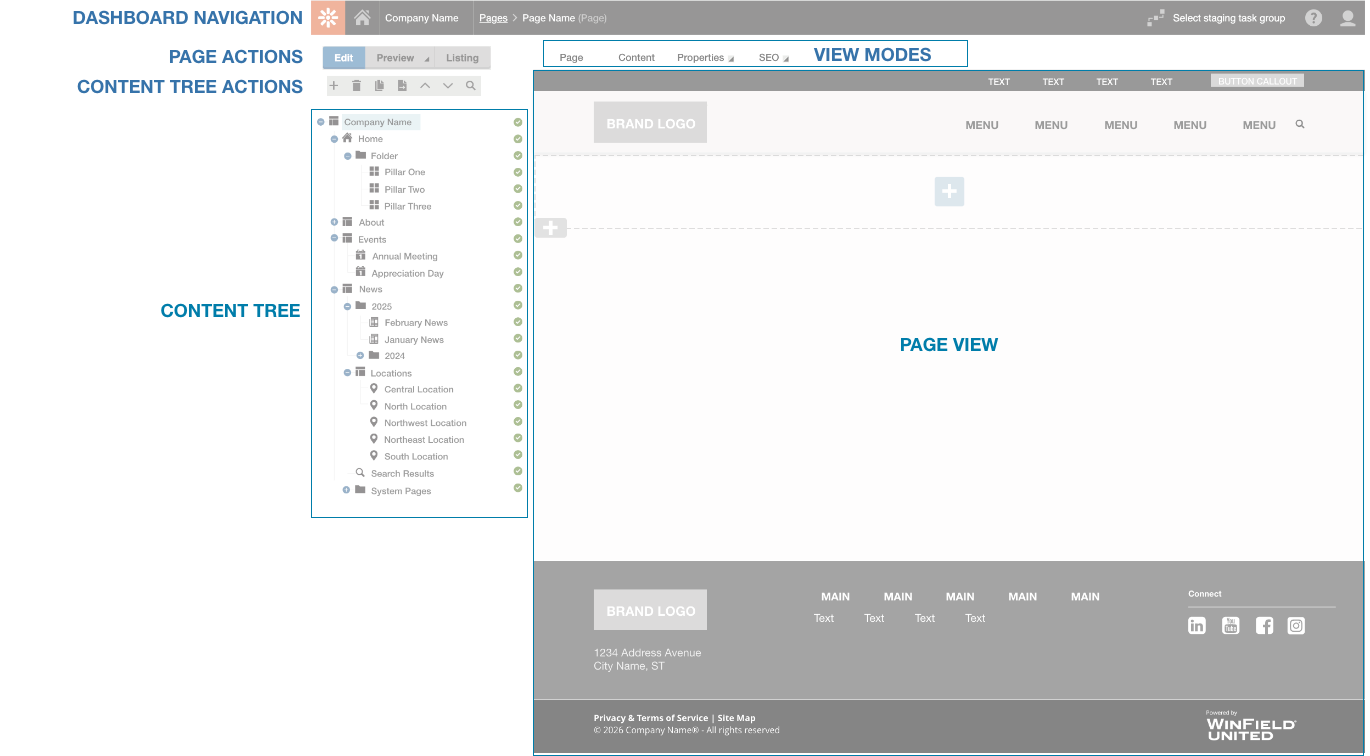
Page Actions
Page actions change the mode of the workspace from editing to preview to listing. For more about page actions click here >

Edit
The default page action is Edit. The editing mode features a workspace with a tabbed interface. View modes include Page, Content, Properties and SEO.
Visit Pages Application for a complete description of these view modes and their functions.

Preview
The Preview page action changes the workspace to preview mode. It shows the current page as it will appear in a normal browser for review and testing.

Listing
The Listing page action changes the workspace to an overview list of pages within the site. It shows each page type, date of modification and has a robust search function. Page actions include copy, move, delete, and import.
Content Tree Actions
These actions effect the content tree workspace to add, delete, duplicate or move pages in the website.
New
Select a location in the content tree for a new page to appear beneath. For instance, a main navigation page such as Energy, might have a secondary page below it for Propane. Clicking the plus icon will open a list of available optional page types in the workspace. Selecting one of these will lead to a request to name the page and possibly more information such as publishing date.
Find in-depth information by exploring ATLAS Page Types.
Delete
Select a page in the content tree and then click the trash can icon. The workspace will have a confirmation button before final deletion. Clicking the checkbox will destroy the page and its history (page cannot be restored).
Copy
Select a page in the content tree and then click the copy icon. This brings up a copy page popup to select a location for the duplicated page. It’s easy to make a duplicate that’s ready for editing.
Move
Clicking on the move icon opens a Move Page popup to directly select a new location in the content tree.
Move Up / Move Down
Select a page in the content tree then click the up or down arrow icon to change the list order of the page in the tree. Helpful to quickly reorder ATLAS List Item pages, for example.
Search
Clicking on the magnifying glass icon opens a powerful SQL search interface to find a text phrase within any of the pages of the site. The list of results with links will appear when the search is completed.
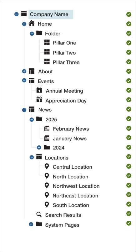
Content Tree Workspace
This is a tree-like representation of the entire website organized in a hierarchy. Each page type in the tree has an icon to identify it. These pages are controlled by the Content Tree Actions as discussed above. To learn more about the various pages types that can be added to the content tree, visit the ATLAS Page Types support page.
Clicking on any Page Type icon in any View Mode in the Content Tree changes the content that appears in the Page View Workspace to the right. Once selected it can be edited or previewed.
Plus icon indicates there are secondary pages/page types which will be revealed in the content tree when clicked.
Minus icon closes the secondary pages in the content tree when clicked.
Published Page: currently appears on the live site
Unpublished Page: available for editing but does not appear on the live site
Redirected Page
Page View Workspace View Modes
Tabs above the page view area change it’s content.
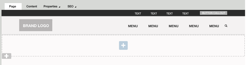
Page View Mode
View of settings to be edited based on the page type selected in the Content Tree. The standard ATLAS - Page Type (menu item) is the example shown below. More Details >
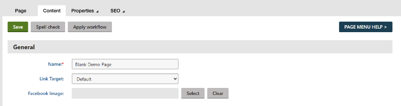
Content View Mode
This view changes content considerably depending on the selected page type. It typically includes a name, various properties and a publishing date. Click for More Details >
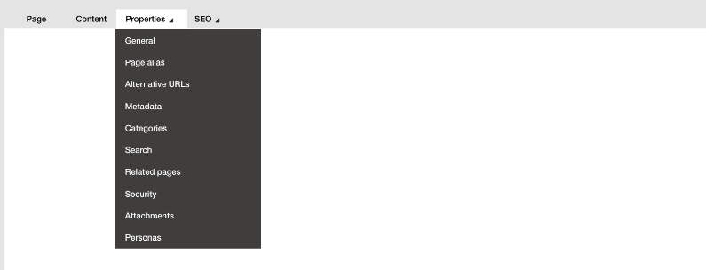
Properties Menu
Multiple View Mode options appear based on the menu selection. For in-depth discussion of all of the options, click for More Details >
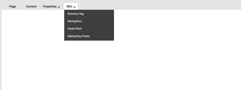
SEO Menu
Multiple View Mode options appear based on the menu selection. For in-depth discussion of all of the options, click for More Details >
Parts of an Atlas Web Page
It is helpful to step back and consider the foundational building blocks of an Atlas web page. An Atlas web page consists of three parts: the header, the body and the footer. When a new blank page is added to a site the header and footer are automatically pulled in. The body area has an initial grid layout to kickstart building the page.
Learn More:
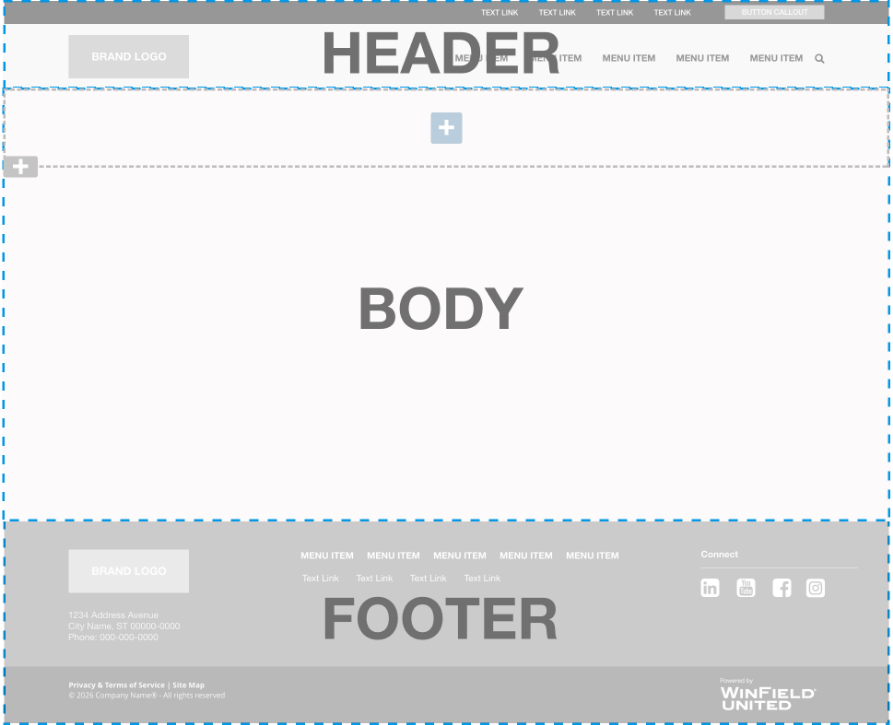
1. Page Header
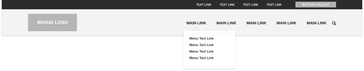
What is the page header?
The page header appears automatically at the top of every page of the website unless specifically suppressed. It is typically composed of a brand logo which is clickable and takes the visitor to the home page, plus a main menu area of primary links with optional drop-down menus of secondary links, and a secondary navigation area of text links at the very top. On mobile these elements are reduced to a logo and a simplified menu that accesses the same main navigation links.
Editing the Page Header Content
Main menu items can be added by creating new ATLAS Page Menu pages at the top level of the site tree. Pages or anchor tags can be added in the drop down menu by creating a new subpage below a main menu item in the site tree. Adding or editing text links in the secondary links area at the top of the header requires the asisstance of the Atlas team.
2. Page Body
What is the page body?
The page body is the flexible editable framework for adding content to the web page.
Editing Page Step 1:
Use Sections to Lay Out the Page
Adding content first requires the addition of one of three types of section layouts. Adding a section creates a customizable frame to plug in widgets from the extensive widget library. The clickable gray plus icon opens a popup to select an Accordion, Tab or Grid layout to be added to the page. Each of these layouts is responsive, meaning that they adjust based on the size of the browser screen and are optimized for mobile.
About the Three Section Layout Types
Clicking and holding the gray plus icon anywhere it appears on an Atlas web page opens a menu of three section types. Sections are the page building frameworks that hold widgets. Selecting any of these drops it on the page and it’s ready to be filled with content by adding a widget via the blue plus icon. The three section types are Accordion, Foundation Tab and Grid. The gear-shaped properties icon to the right opens a popup to customize the background color or image, the margins and the padding. Each grid cell can hold multiple widgets and will stretch vertically to accommodate them.
1. Accordion Layout
The Accordion layout creates an accordion-like visual interface of panes that can open and close on click to reveal or hide content. Up to 12 accordion panes are possible. Accordion Layout Support Page >
2. Foundation Tab Layout
The Tab layout creates a folder tab visual interface with clickable tabs on the page with up to 10 tabs. Each tab can hold multiple widgets. Foundation Tab Layout Support Page >
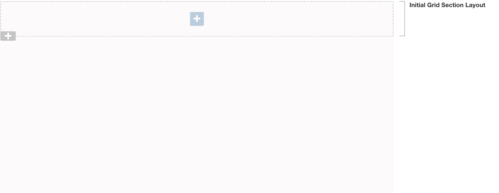
3. Grid Section Layout
The Grid section holds widgets inside rectanguler gridded cells. There are up to 12 cells per grid section which can be organized in rows and columns. Grid Layout Support Page >
Editing Page Body Step 2:
Add Widgets to Section Layouts
What is a widget?
Widgets are plug and play components you use to build and edit your website. They are designed to look great and be simple to use no matter what their function. You add widgets to the page sections using the blue plus Add Widget icon.
There is an initial Grid layout at the top of the page to get started. The blue plus icon signifies a place that a widget can be added. Once a widget is added, a new blue plus icon appears below. Note that each section layout can hold multiple widgets. ATLAS Widgets details >
Types of Widgets
There are four general types of widgets as explained below:
These widgets exist on the page only. All the text and images are added to the individual widget’s properties. Once deleted they are gone forever.
- Anchor Atlas Widget
- Announcement Bar Widget
- Bottom Bar Widget
- Buttons Widget
- Feature Callout Widget
- Feature Large A Widget
- Feature Large B Widget
- Feature Large C Widget
- Feature Large D Widget
- Feature Large E Widget
- Feature Large E Widget
- Feature Large F Widget
- Hero Image Widget
- Horizontal Line Widget
- Image Editable Widget
- Quote Widget
- WYSIWG Widget
These widgets pull in data from custom ATLAS applications such as the Directory Application. When the widget is deleted, the application data remains unaffected and available to use elsewhere. If the application data is updated, the widget is automatically updated.
Directory Application
- Department Directory Widget
- Location Card Widget
- Location Details Widget
- Location Employee Widget
- Location Finder Widget
- Location Special Hours Widget
- Locations Map Widget
Forms Application
Historical Cash Bids Application
Product Application
Product Delivery Application
Safety Data Sheets Application
Timeline Application
These widgets create frameworks to display content from a variety of page types. The widget can be deleted but the pages in the content tree are still available, unless also deleted, to feed into another widget. Each widget requires a path to a folder of specific page types.
- BlogFeed Widget (path to folder of Blog Feed page types)
- Events Widget (path to folder of Event page types)
- Feature List Widget (path to folder of Atlas List Item page types)
- Gallery Widget (path to folder of ATLAS - Gallery Image page types)
- Hero Slick Slider Widget (path to folder of ATLAS - Image page types)
- News Feed Widget (path to folder of ATLAS - News page types)
- Pillars Atlas Widget (path to folder of ATLAS - Pillar page types)
- Repeater Widget (path to folder of Image Gallery page types)
These widgets are actively pulling in data or video feeds from third-party applications. Deleting them from the page does not affect the data. Any changes to the data are a function of the third-party application. These feeds require a membership and possibly a fee.
API Feeds
There are custom widgets available to display market feeds from DTN, Barcharts, and StoneX. These require paid memberships.
Miscellaneous
YouTube & Vimeo Feeds
- Feature Large A Video Widget (YouTube or Vimeo video ID)
- Hero Video Widget (YouTube or Vimeo video ID)
- Video-Playlist Widget (YouTube or Vimeo playlist ID)
- YouTube Video Widget (YouTube video ID)
3. Page Footer
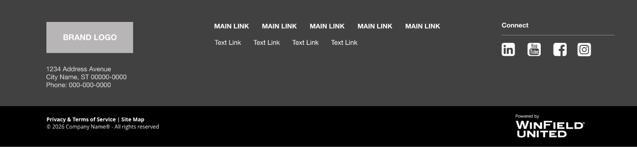
What is the page footer?
The footer appears automatically at the bottom of every page of the website unless specifically suppressed. Footers are customized to meet the needs of an individual client and are designed by an Atlas UX team member. The content typically features a brand logo, the main business address and phone, key page links and direct links to social media properties. Beneath the custom footer area there is copyright information and links to the site map and privacy policy plus a small Winfield United Atlas logo.
Editing the Page Footer
Editing the footer requires the assistance of the Atlas team.