Feature Large A Widget Properties
| PROPERTY | DESCRIPTION |
| Visible | Checking and unchecking the checkbox toggles widget visibility on the page. This allows for prepping the content in edit mode before widget debut. |
| Header | Text entry field for a limited large headline. |
| Enable H1 header tag | Checkbox to add the H1 Header Tag to the widget to improve SEO. Each web page should only contain one H1 Header Tag. Please ensure no other H1 is present on this page when checking this box. |
| Content | Text entry field for any amount of body copy in the default paragraph style. Note this property has a text editor for adding text effects, images, small tables and text links. |
| Content Image | The content image is the single large image that appears next to the text. This image’s recommended size is 640x427 pixels but the height can vary depending on needs. Clicking the Select button opens a dialog box allowing you to select an image via the Media Library Application. |
| Content Image Title | The title attribute on an image adds a tooltip with title text to the image. Hovering the mouse over the image will display the tooltip. Optional but recommended. |
| Content Image Alt Text | This attribute provides alternative information for an image if a user for some reason cannot view it (because of slow connection, an error, or if the user uses a screen reader). Optional but recommended. |
| Button Properties: Number of Buttons | The widget can feature none, one or two buttons by selecting a number from the menu. If the user selects 0 no buttons will display. Anything other than 0 the Button and the below properties will display |
| [Button] Text | Enter text to be featured on each button. Typically shorter text is better for ease of reading and to keep the design tidy. If text field is blank, the button will not display. |
| [Button] Style | Select pre-built style options from the menu. Note that if two buttons are featured, each one may have its own style. Below is the list of styles that can be selected: • Default - a rectangular shape with a solid-color fill • Round - a pill shape with a solid-color fill • Radius - a rectangle with slightly rounded corners with a solid-color fill • Hollow - a rectangular outline shape with a transparent fill • Expanded - an extra-wide rectangular shape with a solid-color fill • Disabled - a rectangular shape faded back to denote that it is disabled • Clear - a transparent button with only text visible |
| [Button] Color | Select from your custom brand colors or grayscale options from the menu for button fills or outlines. Note that if two buttons are featured, each one may have its own color. Below is the list of colors that may be selected: • Default • Primary Color • Primary Color – Light • Primary Color – Dark • Secondary Color • Secondary Color – Light • Secondary Color – Dark • Gradient • White • Light Gray • Medium Gray • Dark Gray • Black |
| [Button] Target | Below are the targets to choose from: Default – this will open in the same tab of the browser and is typically used to move around within your site Blank – this will open in a new tab of the browser and is typically used for links that leave your site |
| [Button] Target URL | Select Page Checked: clicking the Select Button opens a dialog box to access content pages within the current site only. Note that it is possible to type directly in the Target URL field to add the URL to an anchor tag within the site, to type in a third-party URL to leave the site, to open an email (mailto: emailaddress.com) or link to a phone number (tel: 000-000-000). Unchecked: opens dialog box to specifically access the Media Library to select an image or document. |
| Flip Layout | The Flip Layout checkbox swaps the image on the right layout to an image on the left layout to add variety to the design. |
| Invert Text Color | Typically the widget can guess if the text should be dark or white depending on what color background is behind it. But if the visual can be improved by a change from one to the other, click the Invert Text Color checkbox. |
| Background Color | The background color attribute effects the color behind the text and the image to the full width of the page. Initially, Default is selected, which is no color added. Select from your custom brand colors or grayscale options from the menu. Additionally, you can select any color by adding the hexidecimal color code. Below is the list of Background colors that can be selected: • Default (None) • Primary • Primary Color - Light • Primary Color - Dark • Secondary • Secondary - Light • Secondary - Dark • Gradient • White • Light Gray • Medium Gray • Dark Gray • Black • Custom (enter color in hex format – ex. #2c6090) |
| Background Image Small | As an alternative to a background color it is possible to select a large image to appear behind the text and image of the widget. Care should be taken to allow for text readability and clean design. Clicking the Select button opens a dialog box allowing you to select an image via the Media Library Application. For the small background image for mobile devices the recommended size 640 x 640 pixels. Image should not be more than 100kb in file size. |
| Background Image Medium | Clicking the Select button opens a dialog box allowing you to select an image via the Media Library Application. For the medium background image for tablets the recommended size is 1024 x 512 pixels. Image should not be more than 100kb in file size. |
| Background Image Large | Clicking the Select button opens a dialog box allowing you to select an image via the Media Library Application. For the large background image for desktop the recommended size 1920 x 640 pixels. Image should not be more than 100kb in file size. |
| Animation | Clicking the checkbox will engage a fade-in animation effect automatically for this single widget. |

Feature Large A Widget
Gradient Background with Animation
This Feature Large A Widget is a plug and play component designed to hold text, a photo and up to two buttons with or without a background color or image. It’s styled to look great no matter what your content.
Lorem ipsum dolor sit amet, consectetur adipiscing elit, sed do eiusmod tempor incididunt ut labore et dolore magna aliqua. Venenatis cras sed felis eget velit aliquet. Sed cras ornare arcu dui vivamus. In dictum non consectetur a erat nam at lectus. Mauris cursus mattis molestie a iaculis at.
Feature Large A Widget
Primary Light Background
This Feature Large A Widget shows the layout flipped. When adding multiple Feature Large A Widgets back to back on a page we suggest flipping the layouts. Flipping layouts will divide the section information and give your website a dynamic design.
Lorem ipsum dolor sit amet, consectetur adipiscing elit, sed do eiusmod tempor incididunt ut labore et dolore magna aliqua. Venenatis cras sed felis eget velit aliquet. Sed cras ornare arcu dui vivamus. In dictum non consectetur a erat nam at lectus. Mauris cursus mattis molestie a iaculis at.
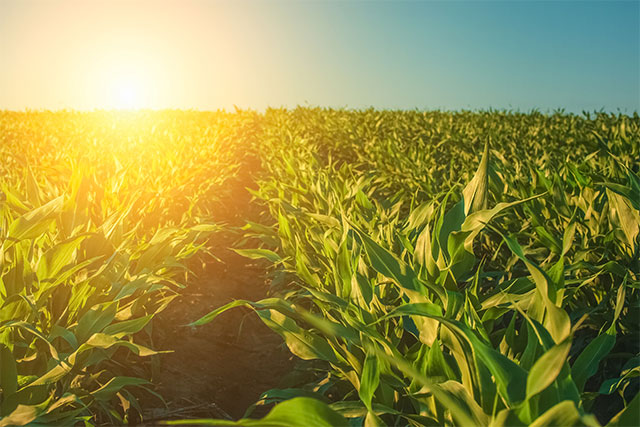
Feature Large A Widget
Image Background
Urna at praesent posuere congue venenatis etiam pulvinar. Efficitur commodo nascetur primis neque ac nostra integer. Vulputate id netus viverra, semper commodo orci nibh accumsan sociosqu. Ut arcu lacinia netus neque bibendum. Eleifend porttitor pellentesque platea dolor augue. Tellus pellentesque condimentum lobortis imperdiet venenatis himenaeos cubilia aptent inceptos. Eget gravida urna faucibus dignissim sociosqu dignissim.
Justo platea neque vitae feugiat tristique nam ridiculus dictum integer. Vehicula volutpat magna tellus; nisi molestie ipsum tempor. Interdum fames commodo tempus malesuada pretium duis. Ut praesent dis porta blandit sed erat.
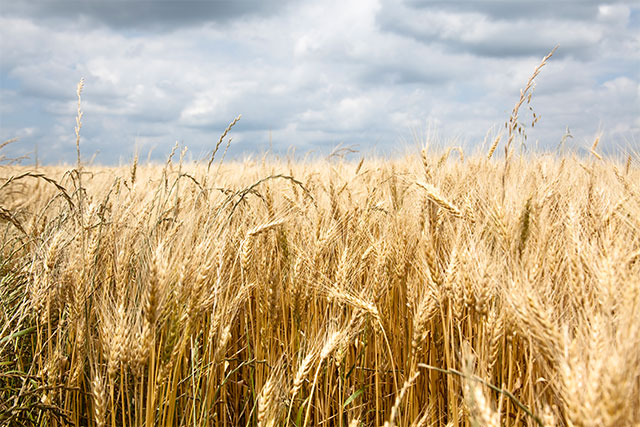
Feature Large A Widget
Default Background – No Color Added
Lorem ipsum dolor sit amet, consectetur adipiscing elit, sed do eiusmod tempor incididunt ut labore et dolore magna aliqua. Venenatis cras sed felis eget velit aliquet. Sed cras ornare arcu dui vivamus. In dictum non consectetur a erat nam at lectus. Mauris cursus mattis molestie a iaculis at. Euismod elementum nisi quis eleifend quam adipiscing vitae proin. Id donec ultrices tincidunt arcu non. Fringilla urna porttitor rhoncus dolor purus. Arcu risus quis varius quam. Eget mi proin sed libero enim sed faucibus. Maecenas ultricies mi eget mauris pharetra et ultrices neque.
Eget est lorem ipsum dolor sit amet consectetur adipiscing. Purus ut faucibus pulvinar elementum integer enim neque volutpat ac. Amet risus nullam eget felis eget nunc lobortis. Arcu non odio euismod lacinia at quis risus sed. Pulvinar sapien et ligula ullamcorper malesuada proin. Quis hendrerit dolor magna eget est lorem ipsum dolor. Quam lacus suspendisse faucibus interdum posuere lorem ipsum. Curabitur gravida arcu ac tortor dignissim convallis aenean et. Donec massa sapien faucibus et molestie. Nisi quis eleifend quam adipiscing vitae proin. Tempor id eu nisl nunc. Aliquam id diam maecenas ultricies. Porttitor leo a diam sollicitudin tempor id eu nisl. Lacus vel facilisis volutpat est velit egestas dui.
- Consectetur lorem donec massa sapien faucibus et molestie.
- Ultricies tristique nulla aliquet enim tortor at auctor.
- Cras ornare arcu dui vivamus arcu felis bibendum ut.
Feature Large A Widget
Black Background
Vehicula sagittis mollis sit cubilia nullam. Tristique etiam facilisi imperdiet pharetra lectus, dapibus massa. Vestibulum taciti nostra nunc odio dignissim. Per nam libero maximus etiam aenean senectus. Arcu ac senectus hendrerit pulvinar neque. At condimentum mattis justo, ridiculus accumsan finibus. Efficitur ullamcorper libero congue nostra iaculis habitant aptent.