FYI
There are two other types of layouts, the Foundation and the Accordion. These are specialized to allow for content to be organized into tabs or collapsable accordion panes. Read more here:
The Grid Layout allows a great deal of page customization because of all the possible cells, rows, margin and padding properties. The Grid Layout is the most-used layout in ATLAS websites. Here’s some tips on how to get the effects you want.
Once you've added a Grid Layout by clicking on the gray plus icon to the left, open the properties and get started. The many optional spacing settings can seem a bit overwhelming. You may find you seldom use most of the available properties. But they are there when a particular layout is what you’re looking for.
Do I need more than one Grid Layout on a page?
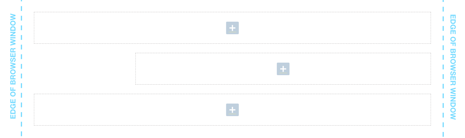
If you have a short page with only Feature Large widgets (those designed to be full-width) you may only need one grid layout to complete the page. But any page that becomes more complex, with different needs for number of columns or different backgrounds will need more than one Grid Section to achieve the best results. The Grid Section can be dragged around on the page to reorder elements during build or any time after.
Think about how your information is grouped. For instance, if you are using several widgets to share information about one topic, you may want to stack them in a single Grid Layout so they can be moved up or down the page as a group if the page needs updating.
NOTE: you can actually add as many Grid Layouts to a page as you need.
There are two other types of layouts, the Foundation and the Accordion. These are specialized to allow for content to be organized into tabs or collapsable accordion panes. Read more here:
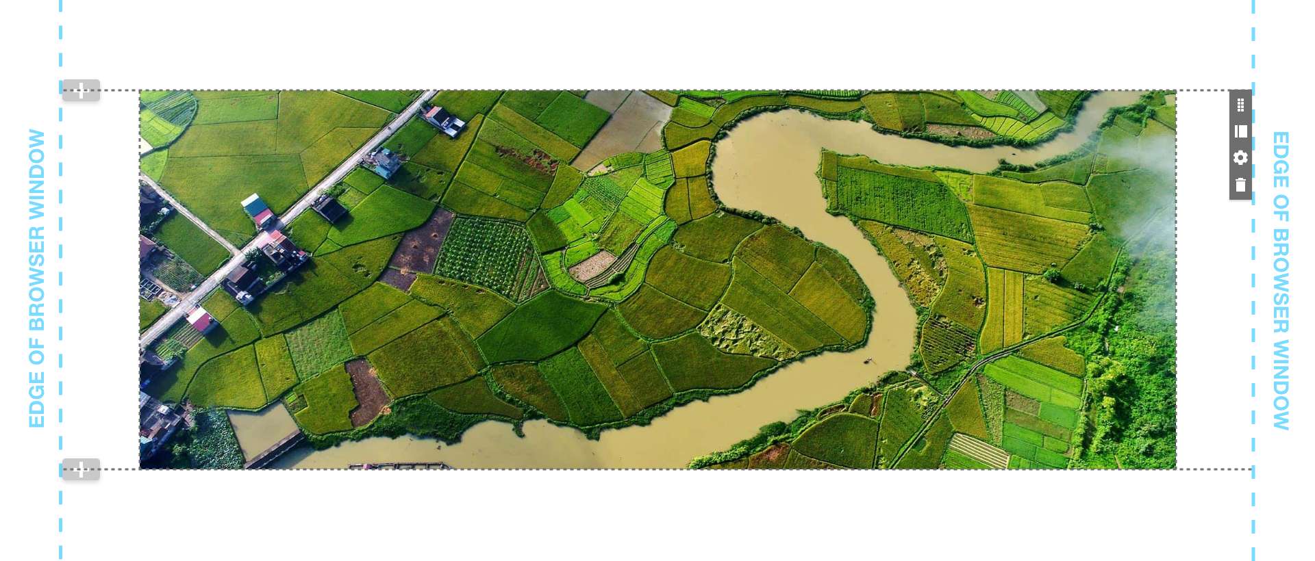
Consider, do you want the overall content be completely full-width, filling the page from edge to edge, or will there be a consistent standard margin between any content and the sides of the open browser window?
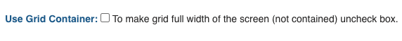
To make the grid layout the full-width of the browser window, leave the "Use Grid Container" box unchecked, which is the default state in the properties.
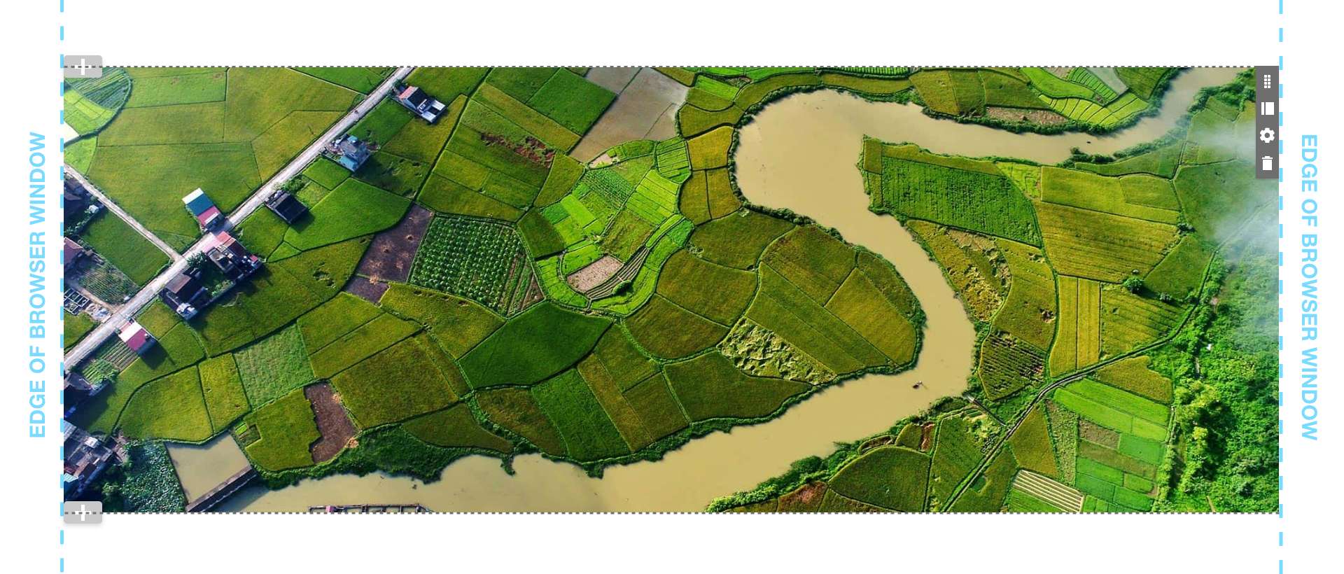
The “Use Grid Container” checkbox should remain unchecked to allow for the feature large widgets to be full screen and look their best as intended. These include the Feature Large A, B, C, D and E plus the Feature Large A Video.
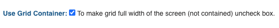
To add the standard margin to the left and right of the layout content, check the "Use Grid Container" box. Note that this setting alone does not add any margin above and below the grid layout.
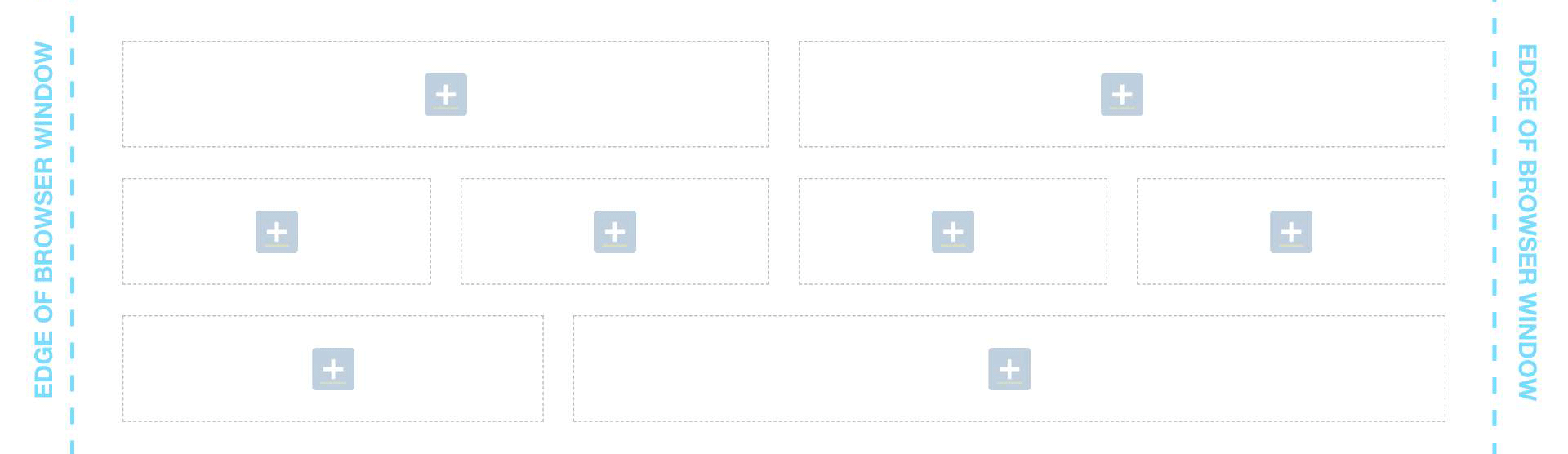
So far we've covered a Grid Layout with only one cell. The properties allow for up to 12 cells in a single section. Think of them as table cells in a spreadsheet. Once again, you have lots of control over how these table cells can appear in rows and columns. Each one of the cells can contain one or more widgets.
Manual
The number of cells in a row can be varied, such as two cells in the first row, followed by four cells in the next, etc. To achieve this depth of placement, you will need to use the Manual setting to add custom percentage sizes to each cell in the properties. Each row of cells should add up to very close to 100%.
Manual Setting Examples:
Remember your site is responsive. Typically you will have no more than one or two columns across appearing on the mobile phone version of the site to be readable. Be sure to test the page.
Block Grid
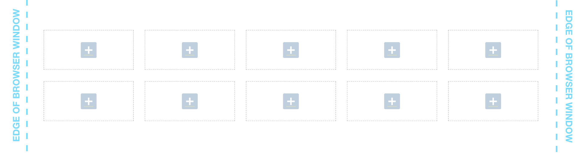
If all of your grid cells are to be of equal size, consider using the Block Grid setting. Rather than entering percentages for each cell on each device, you simply select a number of cells per row from menus for desktop (large), tablet (medium) and mobile (small). Of particular value is the ability to easily set up an odd number of cells per row, such as 5 across.
In the example below, the number of columns is set to 10 while the cells are set to 5 creating 2 rows of 5 equal cells in the layout.
There are other options to create a series of graphics and/or text in a grid format. Two of the standard widgets can create this effect without the need to build out separate cells. Check out:
Space between groups of text or images improves the ability of the viewer to read and comprehend content. Proper breathing room between elements will make your site look more professional and beautiful. Spacing is controlled using the various margin and padding settings within the Grid Layout.
Understanding Margins & Padding
Being able to place your content exactly where you want it on the page with background colors or images, requires the use of margins and padding.
Margins define the space outside of the grid section while padding defines the space inside the grid layout. To visualize the principle, imagine looking down into a moving box. You put a vase inside the moving box and you adding padding around it to keep it from touching the inside walls of the box. Meantime, you set the box next to another box but you leave a margin of space between the two boxes so they don’t touch each other.
Two Types of Margins & Padding in the Grid Layout
Initially it may seem confusing that there are two types of settings, one of which is grouped under Gutter Type and one which appears further down in the properties window. In fact, each serves a separate and necessary purpose.
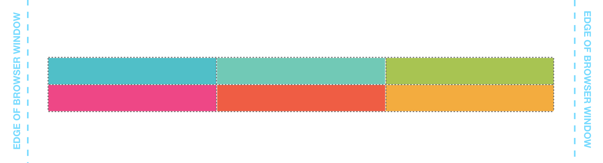
This type applies to the cells and rows inside the container. The margin settings, when checked, add standard space between each cell horizontally (the x-axis) and vertically (the y-axis). The padding settings add padding within each cell horizontally and vertically. Checking both doubles the space between cells. If these are not checked, the content within the cells will have no space between them. This is a rare choice but may work for certain design ideas such as custom graphics with built-in spacing.
Gutter Type: None
All types unchecked. No margins or padding appears.
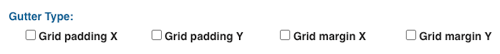
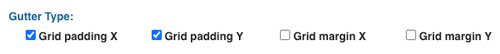
Gutter Type: Padding
Grid Padding X & Y checked for standard padding around content in each cell.
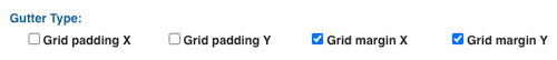
Gutter Type: Margins
Grid Margin X & Y checked for standard margin around each grid cell.
Many of the individual widgets themselves offer margins and padding settings as well for even more control over the page design.
This property adds margins to the outside of the grid container while the padding adds space inside the grid container but not between the individual container cells. For ease of use, four sizes are available from the drop-down menu from small to large. The spacing can be finely tuned using top, bottom, left and right settings.
This behavior is easiest to see, and very useful, when using a background color in the Grid Layout.
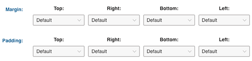
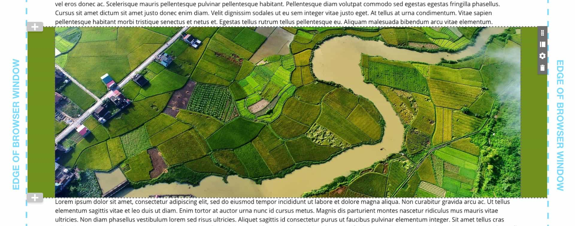
Default Margins & Padding
Note, this example does have the default container margins – hence the spacing to the left and right of the image. Note with default settings there is no space between this container and the text widgets in containers above and below.
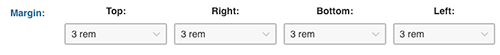
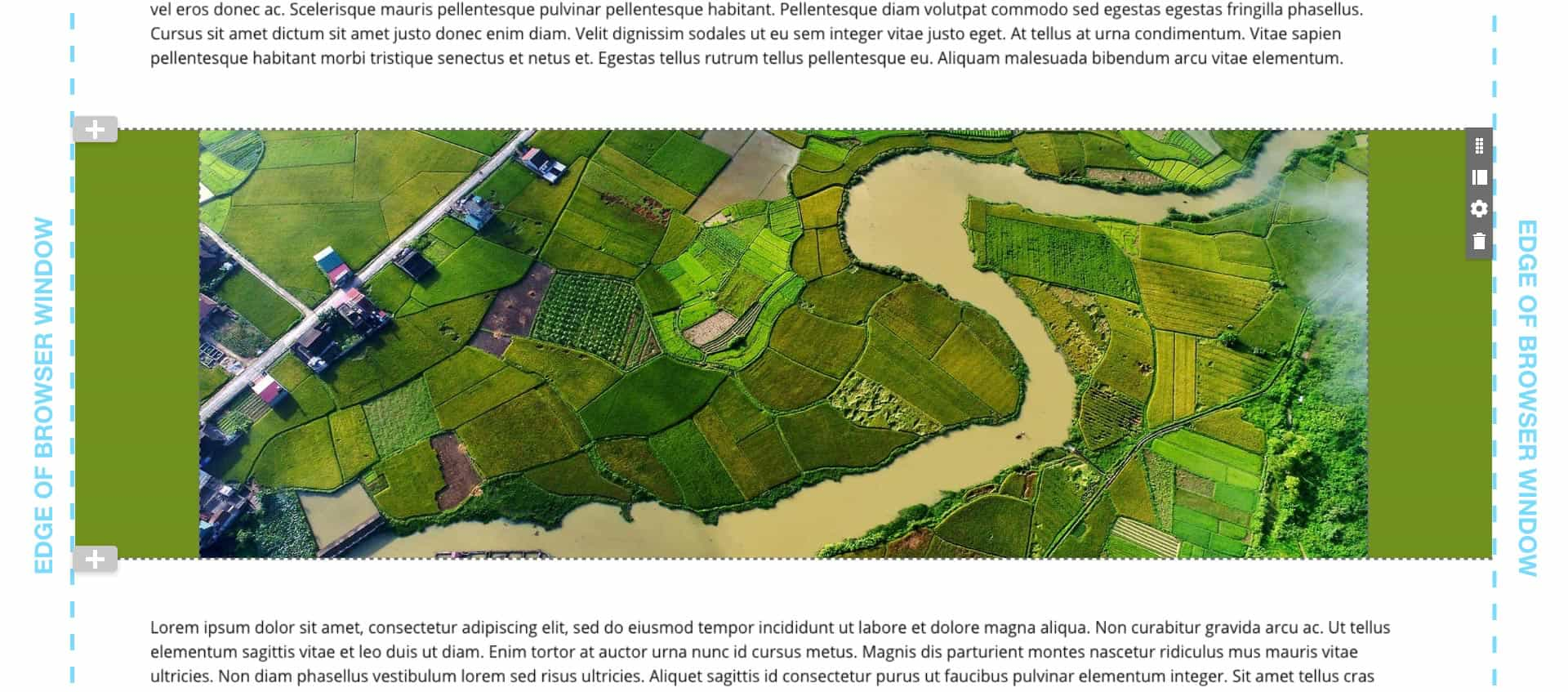
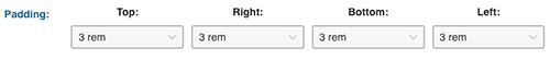
Margin Example of 3 Rem
In this example, the margins have all been set to 3 rem which adds space on all sides of the container. The key setting to note is the top and bottom which add space between the image container and the text widgets above and below, adding readability. In this case the padding is set to default.
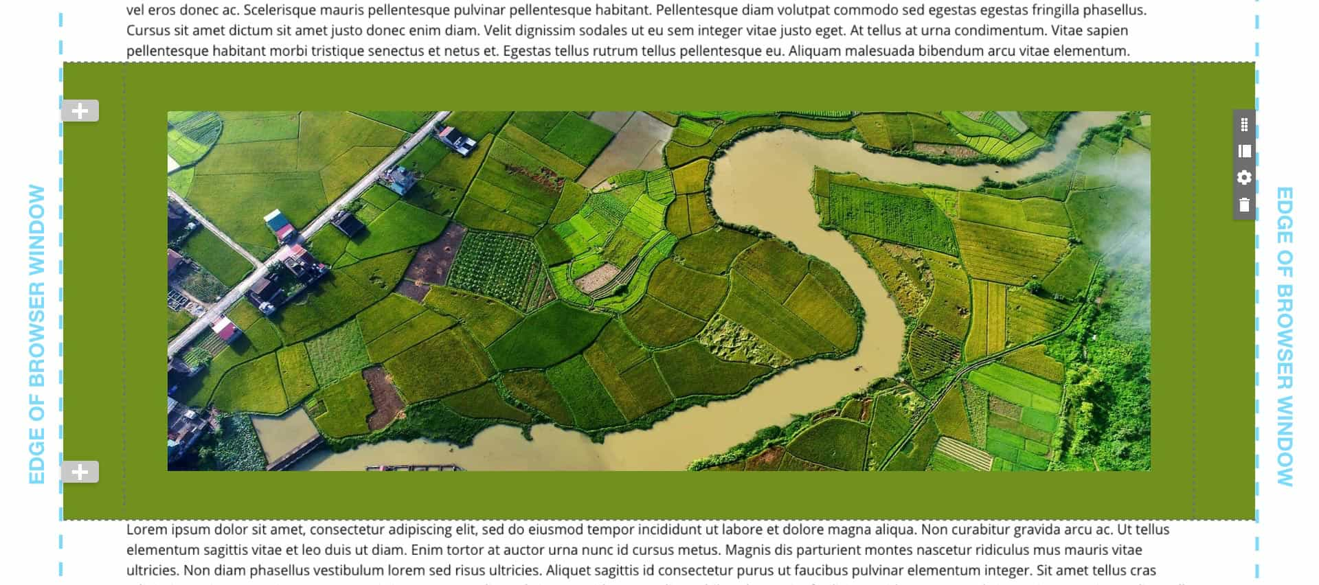
Padding Example of 3 Rem
Note the spacing is added inside the container allowing the background color to extend above and below the image. Because the margins are set to default, there is no space between the example container and the text widgets above and below.
REM is a unit of measure in HTML that equals 16 pixels.
There are yet more settings available to refine the placement of content on the screen in your page layout. We've covered the most common but there are a couple more that may come in handy when a particular effect is wanted. Keep in mind, however, that some of these effects appear differently on mobile where most of your clients may be browsing. Always test before launch.
Below the cell sizing setting there is a checkbox labeled Enable Offset. When checked, menus appear with additional percentage settings for desktop (large), tablet (medium) and mobile (small).
This property does as you would imagine, offsets content in the associated grid cell a certain percentage to the right. If you have a lot of cells in your grid, the settings can multiply alarmingly but it's really a simple setting that offers a lot of control. The key is to know what effect you are trying to achieve and do some testing.
Note that the Offset property is not available when using the Block Grid.
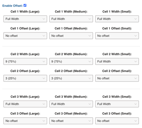
In this Offset example cell 1 and cell 3 are full width with no offset. However, cell 2 is an example of using the offset to move the cell to the right 25%. Because it is moved that percentage, the cell itself is adjusted to be 75% to make sure that the two cells in the row add up to at or close to 100%.
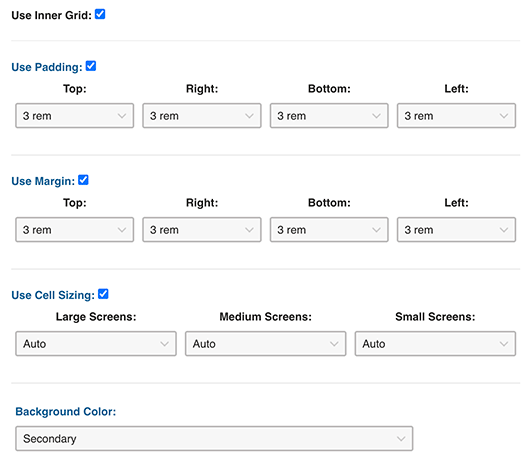
Lastly there is a another powerful property to create additional spacing and placement effects. When "Use Inner Grid" is checked, a series of checkboxes appear for more control over padding, margin and cell sizing.
Inner Grid Example
In the live example below, the inner grid has a background color, 3 rem margins and padding plus inherits the original cell sizing and gutter settings in the grid container by selecting "Auto" from the "Use Cell Sizing" menu. The effect is to create a floating box in the page with it's own background color and various cell sizes.

Dolor sit amet, consectetur adipiscing elit, sed do eiusmod tempor incididunt ut labore et dolore magna aliqua. Veniam, quis nostrud exercitation ullamco laboris nisi ut aliquip ex ea commodo consequat.
Dolor sit amet, consectetur adipiscing elit, sed do eiusmod tempor incididunt ut labore et dolore magna aliqua. Veniam, quis nostrud exercitation ullamco laboris nisi ut aliquip ex ea commodo consequat.