Image Optimization
Oct 17, 2025
Having beautiful, high-quality images on your website makes it unique to your brand and interesting to look at. However, there are several other factors that should be considered when adding images to your website. These factors will help you to optimize website for different devices, maintain your site speed, and execute effective email marketing campaigns.
Image Sizing
The size of images affects not just how they are displayed but also how your site loads and optimizes on different devices. Images that are too large can slow your site speed while images that are too small may lose quality in their display. Widgets such as Features, Heroes, and Sliders allow you to upload multiple sizes of the same image to help your site optimize to differently sized devices such as cell phones and tablets. Check out our specific widget pages to learn more about their sizing recommendations.
A summary of suggested image sizes can be found below. Images can be edited in Adobe Photoshop or using a free online resource such as Pixlr or Canva. The Media Library Application features a light image editor for resizing, cropping, rotating, updating properties. Image compression is handled by free tools such as TinyPNG or Squoosh.
Resize Images Using Canva (helpful for Hero Slick Slider)
Below are the steps you can take to resize images using Canva:
1. Navigate to the hero slick slider on your site and confirm the aspect ratio you have set. This is the size of the image you need for it to preview correctly on your site.

2. Navigate to Canva. Click on “Custom size”, input the width and height of the aspect ratio you need, click “Create new design”.

3. The page will open to the template size you specified.

4. Upload your image to Canva and slowly drag it to drop it onto the empty template. It will auto size to the template size. If you double click on the image, you can drag it up or down to adjust the image.
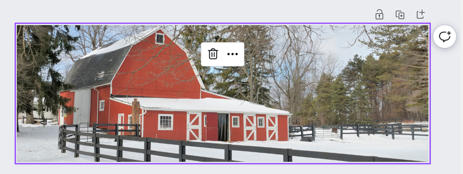
5. If the aspect ratio cuts off a large majority of the image since it is technically resizing the image but maintaining the quality of the image, you can create a graphic out of this same template size. Meaning that you can just drop the image on the template and add other items on the side. This keeps the whole image you need.
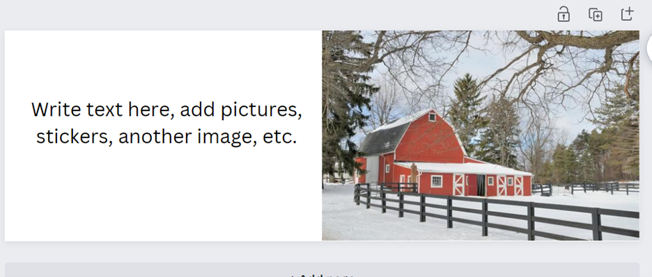
Image Use and Storage
When you're adding images to your site, you'll want to make sure these get uploaded to the Media Library. Content in the Media Library is stored in a cloud, taking some of the weight off of your site. This also allows you to reference an image in multiple places on your site without having to store multiple copies of it.
Adding an image to the content tree or directly into a WYSIWYG may work, but the best practice is to use an image specific widget, like an Image Editable, Hero, or Feature Widget to pull the image on to the page from the media library. Whenever an image is uploaded, be sure to double check you are uploading to a folder in the Media Library and not Content into the content tree.
Alternative Text
Alternative text is the text that appears in place of an image that isn't able to load or that is used by those who are visually impaired. It should provide a brief description of the image or the purpose it serves. Alternative text makes your site accessible to everyone, a characteristic that also plays a role in your SEO scoring.
File Naming
When naming files or images that you will upload on the site, take a few moments to consider how the file is named. Here are some quick dos and don’ts when naming files:
Before you go and rename all your files in Kentico, remember that editing existing names will break the current URL on the site. Even if you change a file name from “Cattle-Image” to “cattle-image” it will change the URL due to being case sensitive. So proceed with caution, or just begin using optimized naming conventions moving forward.
Image Sizing
The size of images affects not just how they are displayed but also how your site loads and optimizes on different devices. Images that are too large can slow your site speed while images that are too small may lose quality in their display. Widgets such as Features, Heroes, and Sliders allow you to upload multiple sizes of the same image to help your site optimize to differently sized devices such as cell phones and tablets. Check out our specific widget pages to learn more about their sizing recommendations.
A summary of suggested image sizes can be found below. Images can be edited in Adobe Photoshop or using a free online resource such as Pixlr or Canva. The Media Library Application features a light image editor for resizing, cropping, rotating, updating properties. Image compression is handled by free tools such as TinyPNG or Squoosh.
| IMAGE TYPE | SIZE (IN PIXELS, W X H) |
|---|---|
| Department Directory | 175 x 175 |
| News Thumbnail | 320 x 213 |
| Event Thumbnail | 320 x 213 |
| Hero/ Slider Desktop | 1920 x desired height |
| Hero/ Slider Tablet | 1024 x desired height |
| Hero/ Slider Mobile | 640 x desired height |
| Feature Images | See Feature Widget Pages |
| Product Category Image | 640 x 400 |
| Product Image | 385 x 550 |
Resize Images Using Canva (helpful for Hero Slick Slider)
Below are the steps you can take to resize images using Canva:
1. Navigate to the hero slick slider on your site and confirm the aspect ratio you have set. This is the size of the image you need for it to preview correctly on your site.

2. Navigate to Canva. Click on “Custom size”, input the width and height of the aspect ratio you need, click “Create new design”.

3. The page will open to the template size you specified.

4. Upload your image to Canva and slowly drag it to drop it onto the empty template. It will auto size to the template size. If you double click on the image, you can drag it up or down to adjust the image.

5. If the aspect ratio cuts off a large majority of the image since it is technically resizing the image but maintaining the quality of the image, you can create a graphic out of this same template size. Meaning that you can just drop the image on the template and add other items on the side. This keeps the whole image you need.

Image Use and Storage
When you're adding images to your site, you'll want to make sure these get uploaded to the Media Library. Content in the Media Library is stored in a cloud, taking some of the weight off of your site. This also allows you to reference an image in multiple places on your site without having to store multiple copies of it.
Adding an image to the content tree or directly into a WYSIWYG may work, but the best practice is to use an image specific widget, like an Image Editable, Hero, or Feature Widget to pull the image on to the page from the media library. Whenever an image is uploaded, be sure to double check you are uploading to a folder in the Media Library and not Content into the content tree.
Alternative Text
Alternative text is the text that appears in place of an image that isn't able to load or that is used by those who are visually impaired. It should provide a brief description of the image or the purpose it serves. Alternative text makes your site accessible to everyone, a characteristic that also plays a role in your SEO scoring.
File Naming
When naming files or images that you will upload on the site, take a few moments to consider how the file is named. Here are some quick dos and don’ts when naming files:
| DO | DON'T |
|---|---|
| Use names that describe the file such as “coop-grain-silo” or “2020-grain-credit-application” | Use generic names like “img-12341” or “application” |
| Use hyphens (-) instead of spaces | Use spaces or underscores |
| Make all words in the file name lowercase | Use capital letters |
Before you go and rename all your files in Kentico, remember that editing existing names will break the current URL on the site. Even if you change a file name from “Cattle-Image” to “cattle-image” it will change the URL due to being case sensitive. So proceed with caution, or just begin using optimized naming conventions moving forward.