Image Editable Widget Properties
| PROPERY | DESCRIPTION |
|---|---|
| Image | Select an image from the Atlas Media Library. (Image size should not be more than 100kb) |
| Image Title | The title attribute on an image adds a tooltip with title text to the image. Hovering the mouse over the image will display the tooltip. Optional but recommended. |
| Alternate Text | This attribute provides alternative information for an image if a user for some reason cannot view it (because of slow connection, an error, or if the user uses a screen reader). Optional but recommended. |
| Height | Enter the height of the image in pixels – optional. If left blank the image will display at actual size. |
| Width | Enter the width of the image in pixels – optional. If left blank the image will display at actual size. |
| Align | Select from:
|
| Margin | Use margin to increase spacing between the widget and other widgets on the page. This is helpful to provide visual room between elements and increase readability. Top User can select from 1-5 rems to increase spacing above the feature callout background area Bottom User can select from 1-5 rems to increase spacing below the feature callout background area Right User can select from 1-5 rems to increase to the right of the feature callout background area Left User can select from 1-5 rems to increase spacing to the left of the feature callout background area |
| Padding | Use padding to increase spacing within the image background area. This is especially useful when using a background color to provide space between the image content and the outside edges of the image rectangle. Top User can select from 1-5 rems to increase room in the top of feature callout background area Bottom User can select from 1-5 rems to increase room in the bottom of the feature callout background area Right User can select from 1-5 rems to increase room in the right of the feature callout background area Left User can select from 1-5 rems to increase room in the left of the feature callout background area |
| Image Target URL | Select Page Checked: clicking the Select Button opens a dialog box to access content pages within the current site only. Note that it is possible to type directly in the Target URL field to add the URL to an anchor tag within the site, to type in a third-party URL to leave the site, to open an email (mailto: emailaddress.com) or link to a phone number (tel: 000-000-000). Unchecked: opens dialog box to specifically access the Media Library to select an image or document. |
| Image Link Target | Below are the targets to choose from:
|
| Content Before | Text entry area for simple title and descriptive copy right above the image – useful for an image header. A light text editor is provided. |
| Content After | Text entry area for simple descriptive copy right below the image – useful for an image caption. A light text editor is provided. |
Carrots Fresh from the Garden
This is optional content placed before the image.

Click image to read about carrots. This is optional content placed after the image. Set to 1920 pixels wide.
Clickable Image
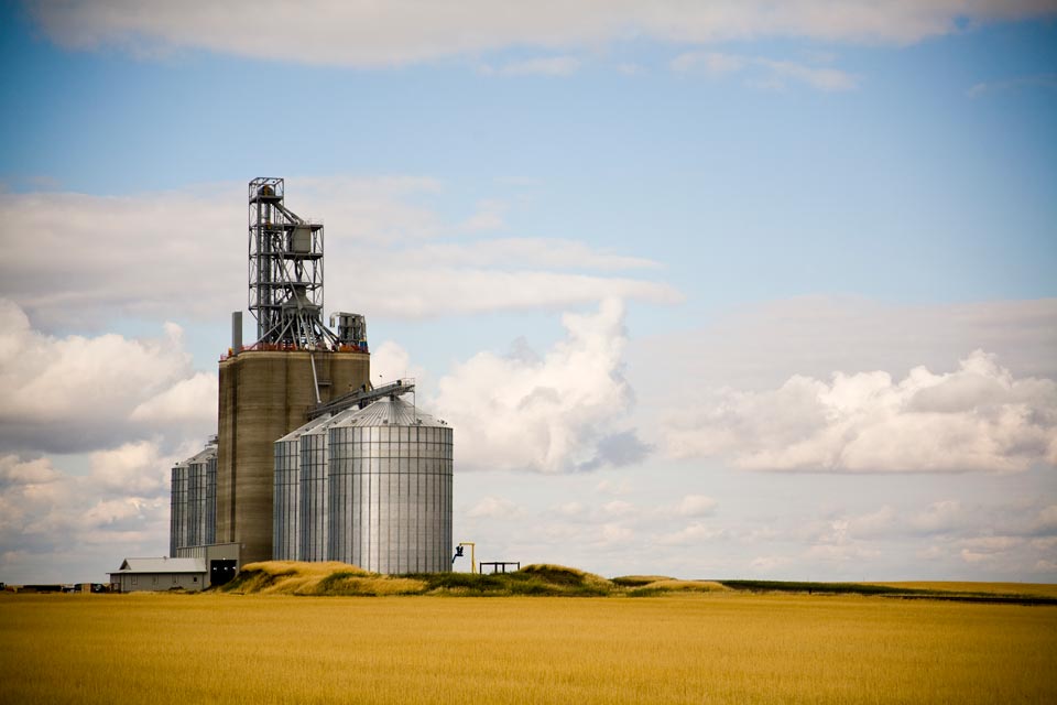
Grain Bins Image 960 Pixels Wide
Clickable Image
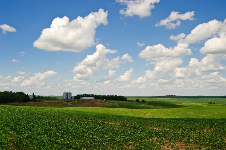
Soybean Field Image 960 Pixels Wide
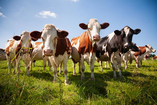
Cows in Field 640 Pixels Wide
Cows in Field 640 Pixels Wide

Cows in Field 640 Pixels Wide

Lightning Image 640 Pixels Wide

Distant Rain Image 640 Pixels Wide

Winter Weather Image 640 Pixels Wide
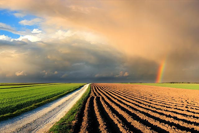
Rainbow Image 640 Pixels Wide
Related Support Video
Closed captions available – click CC icon in video