Gallery Widget Properties
| PROPERTY | DESCRIPTION |
| Visible | Checking and unchecking the checkbox toggles widget visibility on the page. This allows for prepping the content in edit mode before widget debut. |
| Page Path | Folder in content tree recommended for Gallery Image Page Types - select path from content library |
| Transformation | Select the layout transformation (visual presentation) for the gallery: • Slider Gallery |
| Max Columns | Enter number for items visible on page for large, medium and small screens. This choice is dependent on many variables such as the size of the repeated item and the size of the space provided for the Gallery Widget on the page. Testing is recommended on all devices. Large Screens 1-5 images recommended Medium Screens 1-3 images recommended Small Screens 1 image is recommended |
| Image Margin & Padding | Adjusts spacing between images in gallery. Select from: • Standard (30 px) • None Standard setting recommend for a gallery using captions |
| Display Captions | Checkbox toggles visibility of captions on all images if captions were added in the Gallery Image Page Type. |
| Invert Text | Typically the widget can guess if the text should be dark or white depending on what color background is behind it. But if the visual can be improved by a change from one to the other, click the Invert Text Color checkbox. |
| Captions Alignment | If captions appear below each image, select from: • Left • Center • Right |
| Slider Arrows | Clickable slider arrows to navigate the slideshow can be placed below the gallery or to the left and right. Select from: • Bottom • Left & Right |
| Custom CSS | Code provided by the Atlas development team to achieve custom effects |

Planting in the Garden

Planting in the Garden
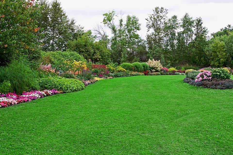
Beautiful Garden Borders

Beautiful Garden Borders
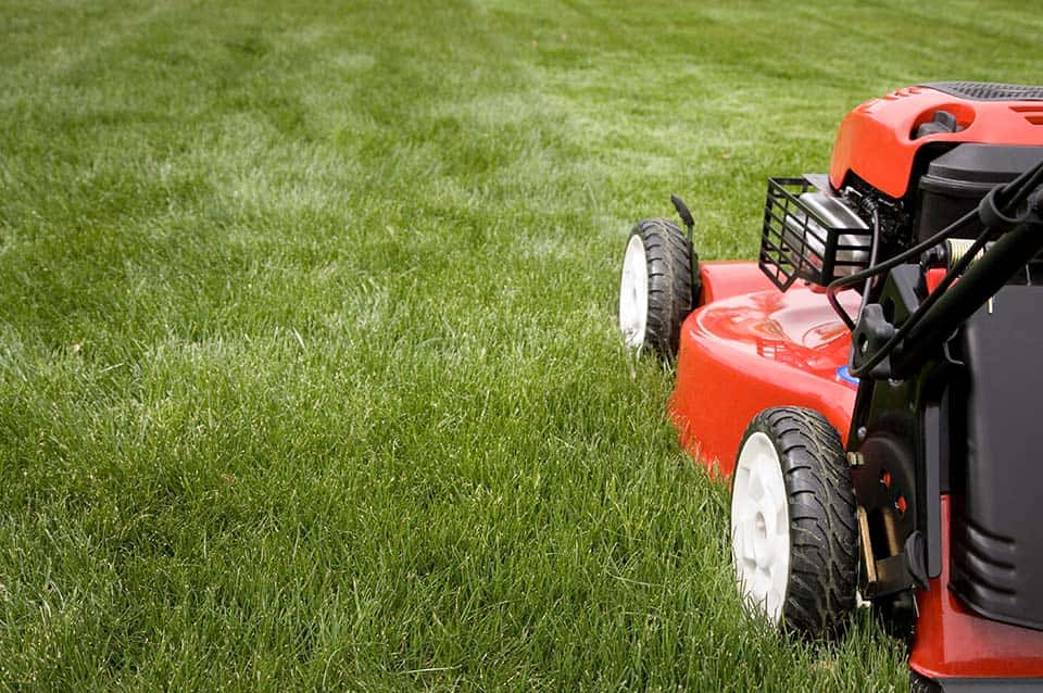
Mowing the Lawn

Mowing the Lawn

Gardening Tools

Gardening Tools

Bed of White Daisies

Bed of White Daisies

Perfectly Edged Lawn

Perfectly Edged Lawn

Potting Marigolds

Potting Marigolds

Healthy Green Grass

Healthy Green Grass

Digging with a Garden Fork

Digging with a Garden Fork
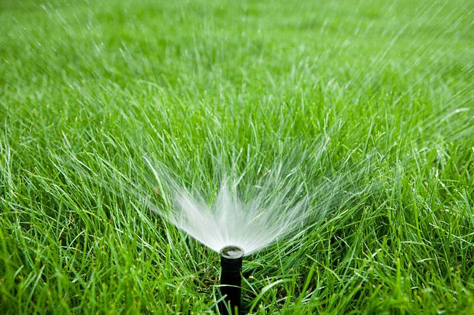
Lawn Sprinkler System

Lawn Sprinkler System
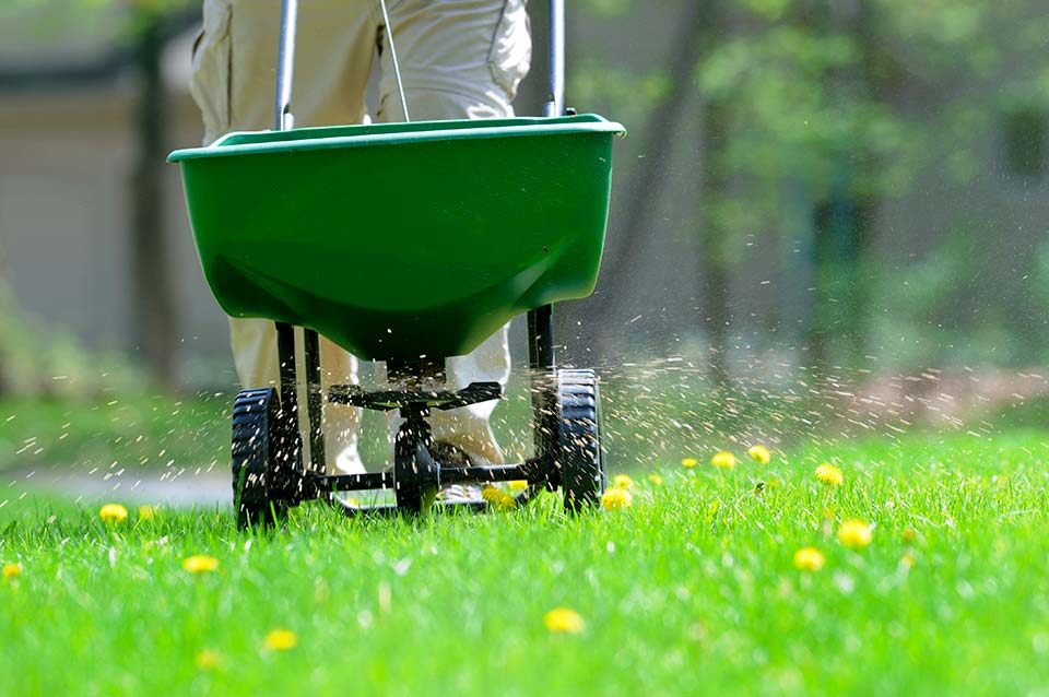
Treating a Lawn Full of Dandelions

Treating a Lawn Full of Dandelions
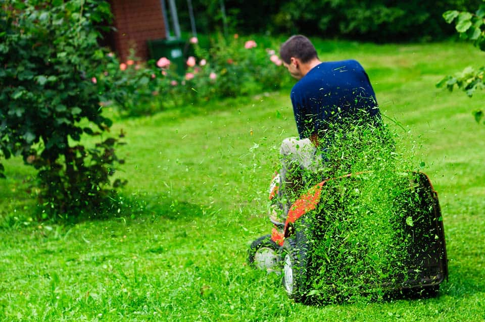
Busy Mowing the Lawn

Busy Mowing the Lawn
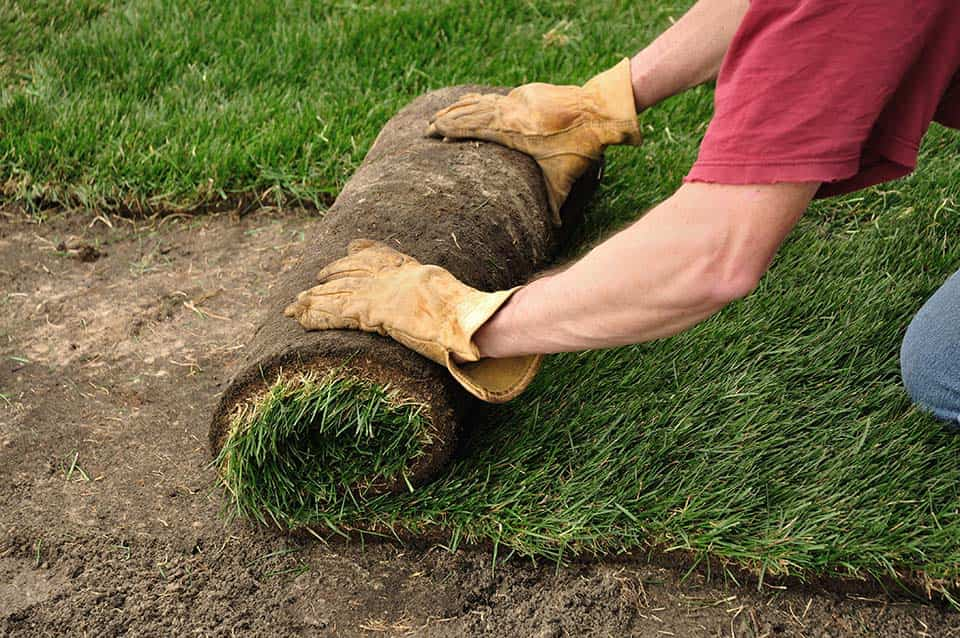
Unrolling Fresh Sod

Unrolling Fresh Sod

